Your sales page is a vital piece in selling your coaching program. You should have a great strategy on what to put on your sales page to make conversions. Today, Kendra Perry will talk about the three sales page mistakes that wreck your conversion in selling your coaching program or course. She also shares some ideas on how to correct those mistakes. Kendra also leaves some tips on what you can do to your sales page to ensure conversions. Don’t miss this opportunity, and join Kendra Perry in this episode today.
—
Listen to the podcast here
Listen on your preferred podcast platform:
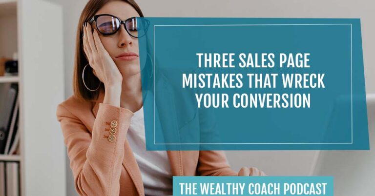
Three Sales Page Mistakes That Wreck Your Conversion
I’m excited as always to be here with you. I cannot believe that it’s February 2024. I know I talked about this in the last episode and it’s annoying, but time goes by so fast, I have to say it. I feel like we’re already halfway through winter and our ski season began. I don’t even know what’s going on with this winter. Anyway, that’s enough about me. Let’s dive into this episode. We’re going to be talking about three sales page mistakes that wreck your conversions.
I see a lot of sales pages over the years. I do a lot of audits. When people are wondering, “Am I a fit for HCA?” a lot of times, I will look at their business, I will give them an audit, so I see a lot of sales pages and I see a lot of bad sales pages. What people don’t realize when it comes to a sales page is there’s a whole lot of psychology that needs to go into a well-written sales page. It’s a big undertaking. It’s not to be taken lightly. It’s not like a bunch of random stuff put together. There’s a strategy to it.
For those of you who are super new, which is okay, and you don’t know what a sales page is, a sales page essentially sells your program. You have been on many sales pages in your life for all kinds of different products. When we are talking about a sales page, a sales page is important, especially if you are selling a group coaching program, a course, or something like that because the sales page does the heavy lifting for you.
If you’re someone who sells off a sales call, I still think you should have a sales page, but it’s a little bit less important because the heavy lifting happens on the sales call. If you are someone who sells with webinars, with challenges, or you have the intention to do so, then your sales page needs to be good. When it comes to a program, something that is a higher ticket, so something that is 500, 1,000-plus, up to multiple thousands, you’re going to want a long-form sales page.
Psychology, I was talking about in the beginning. When we write a good sales page, we want to start with emotional selling, and then help the person back it up with logical selling. The emotional selling speaks to the dream, the outcome, the pain points, everything that the person is struggling with, the reason why someone might want to sign up for your program, and the outcome they can experience if they do sign up for your program. We always want to start with all the emotional selling points, and then we want to start backing it up with the logistics. This is more of what’s in the program. What do they get? I call it the features, the Facebook group, and the modules, when do the calls happen?
You want that to back it up because truthfully, when it comes to selling, people make decisions both logically and emotionally. Usually, the first decision they come to is emotional. They make an emotional decision, but then their brain needs to back it up with the logistics, “Does this make sense to me? Does this include what I need? Are the calls at a time that I can attend?” Think about that next time you’re writing your sales page. Spend the first half of the sales page speaking to benefits, outcomes, and the emotional side of things, and then get into the logistics.
A mistake I usually see people make, and this is not one of my three mistakes, but it popped into my head. There are so many mistakes, but this one popped in. A lot of times, people will reverse that or they’ll remove the emotional selling components altogether. The program sales page will be all about logistical stuff and the features and not get into the benefits and why someone would want to sign up for the program.
The Headline Is Unclear
There are three mistakes. Number one is the headline. The headline is above the fold. You don’t have to scroll, it’s right there on the main screen. Typically, it would be a photo of you or maybe a mock-up of your program, and then it would describe what the program is. A big mistake that I see people make is they don’t clearly describe what the program is and who it’s for. You want to be clear. If you have a niche appropriately and you’ve messaged appropriately, then this should be easy.
I’ll give you an example from Health Coach Accelerator. When you land on the Health Coach Accelerator page, I have a big photo of me and you don’t need to scroll. I have Health Coach Accelerator in big letters and above Health Coach Accelerator says, “Systemize your biz, book dream clients, and find some freedom inside Health Coach Accelerator.” I then have the tagline, “Your no-bullshit guide to building a thriving six-figure online wellness program that changes lives.”
It’s very clear what the program is. The program is going to help you build a six-figure online wellness program. You’ll see the program name and there’s a nice photo of me. You want to have a good headline. What I see from a lot of people is it’s not clear. Right off the bat, it can confuse people. It’s like, “Where is this going? What is this all about? What is this program for?” That can be extra confusing if it does not line up with what they read previously. Meaning that maybe they came off of a webinar or maybe they read some sales emails and they ended up on your sales page.
If it’s not aligned, if they don’t essentially say the same thing, then the person is going to be confused. Anytime a person is confused, you are less likely to make a sale. A confused mind doesn’t usually say yes. A little bit of confusion is okay because some people get confused, but if you get people very confused, they’re definitely not going to want to invest in your program. You want to have that clear headline that clearly describes what the program is and who it’s for.
Now, a little bonus tip here. A lot of people will put a button there. They’ll put a button in the headline that allows them to go to the order form. I don’t recommend doing that because what people are going to do is they’re going to click over to the order form to look at the price, and they’re going to forget about the rest of the sales page. The only difference here is if you have a sales page that goes to a sales call, then I would have a button there because the goal is to get people on the call. The heavy lifting of the selling happens on the sales call. It’s okay to have a button to your schedule up at the top, but if you’re selling from an order form, I would not have a button up there.
Too Much Focus On Features Versus Benefits
The number two mistake is there’s too much focus on features versus benefits and outcomes. I talked about this a little bit previously when we talked about emotional versus logical selling. When we think about logical selling, it’s like, “You’re going to get a Facebook group. You’re going to get seven modules that are recorded into videos. You’re going to get email support.” That is what I call features. Those things do belong on a sales page because people are going to want to see that, they’re going to want to know, “What do I get?” The sales page cannot be focused on that. This is a big mistake that I see. People put a whole lot of focus on the features, but they don’t clearly describe the benefit or the outcome.
Truthfully, when we think about features, that’s what makes up your program. People don’t understand why they are important because you are the expert. You have strategically designed your program to get someone a particular result. Everything that you’ve put in your program has a purpose and you clearly understand why it’s important, but your person doesn’t because they’re not an expert on the problem. They’re not the practitioner. They’re not the coach. They’re a person with a problem who wants to get to a result or an outcome as quickly as possible.
When they look at the features, if you’re like, “You get this module on stress management,” maybe the problem is fatigue or something. They’re probably like, “Why is it important for me to have a module on stress management? I don’t get it.” You’re like, “You get a private Facebook group? Why do I care? What am I going to get in the private Facebook group?” We want to spend that first part of the page focusing on the benefit, the outcome, and the emotional selling points.
Even when we get to the part of the sales page where we describe the features, we want to make sure we tell them explicitly why it’s important. Something that can help with this is so that you get a Facebook support community, and then insert the outcome. Tell them why it’s important for them to have access to a Facebook support community. Tell them why. Be very explicit with that.
Poor Sales Page Design
The third one is more of a design aspect. When you build a sales page, you want to make sure there’s lots of white space and there’s a variation in colors and images. You want to make sure that it’s broken up. The worst thing that you can do is have a whole lot of texts bunched up together because that’s very hard on the eyes. Any of your favorite expert or influencers online who has a sales page, for example, you could go to the HCA sales page or anyone, go look at their sales page and you’ll notice that there is a nice design aspect to it. They have different sections with different colors. They have images and maybe infographics that break it up. They have different sizes of text and you’re never going to see a whole whack of texts all bunched up together.
This is important because the design is also important in selling. You don’t want it to be hard on the eyes or not very readable because people don’t have patience for that. I truly believe there’s a lot to be said for hiring a designer to design your sales page. If you’re not a designer, if that’s not something you want to do, you can get someone to do it for you. You can find someone on Upwork. You can shoot me a message and I can always recommend someone for you. It’s worth it to get your page design because you could have an amazing copy. It could be incredibly well-written, but if the design is messed up or it’s hard on the eyes and it’s not easy to navigate, then that copy’s not going to matter. Making sure it’s designed well is also important.
Those are the three mistakes. 1) The headline is unclear. It doesn’t speak to what the program is and who it’s for. 2) There’s too much focus on features and not enough focus on benefits and outcomes. 3) Poor design, not enough space, colors, or images to break it up, and it all mixes together and it doesn’t look good. Those are the three mistakes. I also want to give you a few bonus tips for sales pages that I have found to be incredibly helpful.
The one thing that I love is I always have a messenger chatbot on every single one of my sales pages. I have it on the main sales page and I have it on the order form. This is essentially a Facebook Messenger plug-in and it goes directly to your business page. The reason I like this above other chat supports is that you get someone in their messenger. Most people have Facebook Messenger on their phone and they use it for personal use. Basically, they’ll send you a message through their Facebook Messenger, and then you’ll be able to send them back a message to their Facebook Messenger. That typically results in a notification in their pocket.
Most people have notifications turned on for Facebook Messenger versus other chatbots that you can do, usually, they will go to email, which is fine, but I don’t find people are as responsive with email. I find people are a lot more responsive through Facebook Messenger. I’m a big fan of that chat. If you sign up for a Business Facebook account, so Business.Facebook.com, you can get that plug-in and put it basically in the header of all your sales pages.
I find this effective because people can send you questions. You can go back and forth with them in direct messages. It’s way more seamless than email. My favorite part about it is typically someone is going to get a notification. I don’t think anyone has notifications turned on for email. That would be a nightmare. The next tip I want to give you for having a good sales page is to make sure it looks good on mobile. Typically, most builders will have a mobile and a desktop version, so you’ll be able to see it on both. You may have to switch things up and use different images because you want to make sure it looks good on mobile. Definitely check that out. What I would do before I publish it is I would open it on my phone and see what it looks like. I see a lot of sales pages where the text is way too big.
To be frank, it looks like crap on mobile. The truth is most people are accessing the internet through mobile these days. Most people are scrolling on their phones. A lot of people aren’t on their desktop or their laptop. When I see my analytics for my sales page or my Google Analytics, 80% to 90% of people are accessing through mobile. You want to make sure that it looks good on mobile and that it’s well-designed.
The third one is one of my favorites. This is a little bit more techy, but if you have a lot of sales page traffic, this is a good one and this is to have a heat map on your sales page. A heat map is essentially something that tracks how people are interacting with your sales page. I use one called Mouseflow. It’s relatively inexpensive. What it does is it tracks analytics on our sales page. It’ll record people on the sales page.
Obviously, we don’t know their identity, but we can watch those recordings and get a sense if people are getting tripped up somewhere. Maybe someone sees something and they think it’s a button. They’re clicking on it because they think it’s a button. That’s a sticking point in your sales page. You’re like, “I’m going to want to design that a little bit differently because people clearly are getting tripped up on that.”
It also shows you the amount of people who are consuming your entire sales page. With my last launch with Health Coach Accelerator, what I learned is that people were only getting through about 30% or 40% of my sales page. What I did was cut a whole bunch out. It told me that the sales page was way too long. I ended up having to cut it down. A heat map can give you a lot of information on your sales page, especially if you have a decent amount of traffic going through it.

Personally, I only like to make decisions based on the data and the numbers because, without it, you’re shooting in the dark. I could be like, “I’m not sure why this sales page is converting. I don’t know.” What I learned is that people aren’t getting through it. It’s too long. People are getting tripped up on this one image that looks like a button.
Those are my best sales page tips. I hope you find that helpful. I think there is a lot to be said for having a sales page written by a professional copywriter. It can be expensive. Obviously, a good copywriter is expensive, but if your business is generating good income and your program is profitable, then I do think it’s a great investment to make. I hope you enjoyed this episode. I will see you same time in the same place next time when I help you become wealthy AF.
Important Link