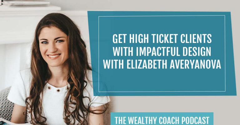
What are the steps are you taking to get high ticket clients for your business? Join our guest, Elizabeth Averyanova, as she explains how you can utilize your online presence more. Elizabeth is a brand strategist, digital marketing expert, web and architectural designer, and founder of Studio Classica. Elizabeth shares tips on how she is helping entrepreneurs and other industry leaders to scale their businesses with impactful, beautiful designs to attract dream clients and elevate their online presence.
Listen on your preferred podcast platform:
Get High Ticket Clients With Impactful Design With Elizabeth Averyanova
In this episode, I am hanging out with a guest who I know you are going to love. We are going to be talking about branding and design. I loved this conversation because I felt like me and Elizabeth were very much on the same wavelength when it comes to websites and design. When you get started as a new business owner as a health coach, usually the first thing that you think you need to do is build a website. If you are brand new to the show and brand new to hanging out with me, you may not have heard me say, “Screw your website a million times.” That is something I say all the time. The reason for this is there is a hard bar for websites out there.
People do not have a lot of patience for websites that are hard to navigate, confusing, load improperly, or are not responsive. People do not have patience for that at all. When you build a website that is not completely professional, beautifully designed, has the right copy, and is easy to navigate, it can hurt you and not help you. It can lead to clients not wanting to work with you. Before I started recording with Elizabeth, she said, “It is better to have a good Instagram than a bad website.” I love that. I also think it is better to have no website than a good website. In this episode, I am sitting down with Elizabeth Averyanova. We are talking about all things branding and design. We are going to cover the elements of a highly attractive brand.
We are going to talk about how you can determine what the best colors and fonts for you to use are. Finally, you are going to get a Canva design tip that is going to blow your mind because, honestly, it blew my mind too. A bit more about Elizabeth She is a brand strategist, digital marketing expert, web and architectural designer, and Founder of Studio Classica. Elizabeth helps purpose-driven female entrepreneurs, coaches, and industry leaders scale their business with impactful, beautiful designs to attract dream clients, elevate their online presence, and book out their offer as well as creating a lasting legacy in the world.
Her branding and studio design, Studio Classical, specializes in strategic all-in-one Kajabi websites, high converting sales pages, and online coaching program launches. She has helped numerous coaches and women entrepreneurs with six-figure online coaching program launches, impactful and effective landing page creation, and behind-the-scenes business systems that free up your time from daily tasks without the design or tech overwhelm. I know you are going to love this interview with Elizabeth so let’s dive into it.
—
Elizabeth, welcome to the show.
Kendra, I am excited to talk.
I am very excited to talk about design, branding, and topics that I know my readers are dying to know about, but before we dive into it, I would love it if you could just let our readers know about yourself and how you got into what you do.
I am a web and architectural designer and it has been an interesting journey in my online business. I started my business many years ago and it has been online since day one. I have been around this space for a long time and I have seen a lot of things. I started my business as a designer trying to DIY and figure out everything.
Over the years, we took on a lot of different types of services as designers and architects. Eventually, we niched down to focus on branding and web design, especially for online coaches and female entrepreneurs. That has been a whole journey from being Jack-of-all-trades as designers to being much more niche down and focused on branding and design, especially for this audience. That is the mini version.
Did you notice when you niched down that things got easier and you could get more clients?
We did make a huge transformation once we niched down. The process of how I got into helping coaches began as my own journey. I was burnt out with the type of clients I was working with previously as an architectural designer.
When you say architecture, are you talking about building architecture?
I am talking about buildings. I am talking about designing houses, multifamily apartment buildings, and also doing commercial projects. We had a lot of London-based clients, so it is a different range of clients and they were all mostly through our online design services. It was a unique thing as an architecture person.
I love that because I like to nail home to my readers how important niching down is. They resisted a lot, but it is good to get that confirmation as you were working as a Jack-of-all-trades and then you honed in on your person. It sounds like things got better.
I dove into a coaching program to learn how to be a coach. I thought I was going to be a health and fitness coach. That is my other passion, but I was totally new to the field. I was not a certified personal trainer. I did not have any experience in health and fitness other than my own personal interest of running. I took this coaching program on how to be a coach. I learned so much more than that twelve-week program than in many years of running an online business. I learned sales, social media marketing, and the importance of niching down.
In a roundabout way, I left that program. A couple of months after that, I am still passionate about health and fitness, but maybe I can loop this back to my design skills because I love designing and creating things. That has been a huge part of my personality since childhood, so I ended up connecting with them. My first clients were a lot of the health and fitness coaches from the coaching program I was in. From there, through referrals, so I was able to niche down to doing the design, especially branding and web design for those coaches. It was a great thing. Niching down is huge. It was a game-changer.
Let’s dive into the branding and design stuff because our readers are super new for the most part. Even me personally. It took me years to understand what a brand was. From a beginner’s perspective, can you describe what branding is?

There are so many definitions you are going to find online. What is branding? What does it mean? It is simply the representation of yourself, especially when you are talking about personal branding. You are the face of your business and your coaching business. Your brand is the extension of you online. It is how you show up on social media and your website visually but also how you talk and the words you use. The brand is your representation online.
It is almost like an online persona or something like that.
It should not be a reflection of who you are, but it also should be a bridge to connect to your ideal clients. It might not sum up everything that you love and everything that you do, but it certainly should be authentic to who you are and what you are as a person.
You said that there is this visual representation of the brand and then the voice and the personality side of things. When you work with clients, are you combining the two? I know you do a lot of web design, but are you also trying to bring out the personality in that visual representation?
If you are an online coach, your personality is what is going to differentiate you from your competitors. Bringing in your personality is a huge component and what makes up your personality. It is not only the foods, the colors, or the fonts you like, but also how you talk, what words you use, or do you use swear words or do you not? What tone of voice do you use? Your branding is a combination of these things. When we work with clients, it is all about figuring out their personalities and figuring out who their ideal clients are, and then connecting them.
Why is this important? How does having a strong, cohesive brand help people get clients?
The number one thing is it will help you attract the right clients because you certainly do not want to attract people who are not going to be a good fit to work with you. You will not be passionate about showing up for your business. The opposite of that is you will attract your dream clients and the people who are the right fit to work with you in the way you coach or work.
You will also attract repeat customers or clients if you make a good branded and elevated experience with them. They will come back to you again and again. That reduces your need to have to continually find new clients every month or every three months into your program. You will also attract referrals potentially because if they love their experience, they will talk about you to other people, so you will get referrals.
You said something important there that the brand identity is what makes you stand out online. That is important because my readers, who are health coaches, think what makes them stand out online is knowing a lot of things and being smart. It sounds like that is not the thing. It is more about the personality.
It is connecting your personality with the practical things like the colors of your Instagram posts, the way that you do your Instagram Stories, or if you have a specific color palette or style with how you do your graphics. That will make you more instantly recognizable so that when your potential clients are scrolling through Instagram and spending hours there, your posts will stand out to them because it looks professional. If you start to use the same branding, it will be consistent and they will see it again and again. They will get to know you and ideally, if they are the right people, they will get to like you, trust you, and hire you.
How can people figure this out? You mentioned in the beginning that it is not all of you. It is an online persona. It is authentic to you. It is parts of you, but it is not everything that you are because that would be impossible. How would our audience figure out what aspects of their personality they should be bringing into their brand?
I have a process that we do with clients where it involves starting with your goals in your business, understanding what your goals are for the next 3, 6, or 12 months, and understanding that is a huge component. The next piece of it is understanding your ideal clients and getting very specific with that because it is one thing to say, “I am going to target Millennials who like avocado toast.” That is a huge amount of people.
You need to get more specific on exactly what your help is. Maybe you are helping new moms who gained baby weight or they are a Millennial who likes avocado toast. You have to get clear on your ideal client. Tying that back to your personality is what your mission is and what your values are in your business. We go through a process from those things and then start to bridge into the visual side of it.
It sounds like the most important thing to figure out first is the personality side of the brand and then from there, you can figure out the visual. Is that correct?
A lot of people, in the beginning of the business, have only been DIY-ing like if you have an Instagram and you try to post things. A good place to do if you are in that place is to do a brand audit to audit where you are right now. It might sound boring, but it is first to get us a reality picture of where you are right now. I have a free gift on how to DIY your brand audit, so if you are interested, you can message me on Instagram for this, just type the word “Brand Audit.”
As part of the process, we also look at other people in your niche, in your market, or in your little world of where you are on Instagram and get a good reality picture of, “What are these things right now?” That helps, “What is the direction we need to head with my brand? What is the next step? How can I make this better? How can I make this a more impactful design to help with your goals?”
What would be a few questions from that brand audit that our readers could ask themselves or specific things that they can like look at and assess?

There are 5 or 6 steps in there. An important one is looking at your visuals. This one is a great place to start because it is more tangible and look at how you are currently posting on Instagram if that is the main platform you are using. What colors and fonts are you using? What are your photos right now? Are they DIY? Are they professional photos? Are they mostly the same selfies or is there variety? What is your style of photography? Do you have a freebie? Do you have a website or not? Take a clear evaluation if you are proud of that? Are you proud to send people to those things?
I feel like a lot of our readers are not. When you start a new business, you have design skills, but our readers do not. They are in Canva. It was crazy when I started my business. Canva did not exist. I do not even know how I did anything. People are choosing random things, but is there a method to it? Are there certain colors you should be chosen based on what you are trying to put across online?
There is a whole color psychology world and how certain colors make you feel and the emotions colors bring out in you. Take a moment to look into it. A quick Google search can tell you a few things about colors and what they could mean. Think about how that connects to your ideal client.
If you are a meditation coach and you have a soft personality then it does not make sense to use strong colors like reds and blacks.
Most people have a good intuitive sense of what colors they personally like. I am very clear on what colors I use and I like. An easy way to tell is, for a lot of people, to take a look in your closet and what is the color they feel there?
Before we started this interview, you said a good Instagram is better than a bad website. Can you speak to that?
When you are starting your business, you always think, “I need a website.” If you are not ready to invest in professional website design and do not have the skills to do it or if you try to DIY it and then it does not look good, it is not coming together, but it is live and your ideal clients come to it, they are not going to be impressed.
They might be confused like, “I am not sure what this person does. I am not sure if they can help me. I cannot tell. This website is stressful.” They will just close it and move on. You are potentially losing sales by having a bad website. Whereas if you focus on a good Instagram and you do not have time for the website yet, that is better because you can get clients from Instagram without the website.
This is what I say all the time. When people want to sign up for my program, they are like, “Do you help me build my website?” I am like, “I do not do that. I will help you get clients off of social media and through all these other ways.” There is this idea that, “I need a website to be professional.” You are totally right that it is better to have no website than have a crappy website that turns people off.
As I am planning this online virtual summit, I am looking at a lot of websites. I am looking for people who are going to be the right fit for speakers. It has been interesting to watch my behavior when I pop on someone’s website and I am confused about what they do. Maybe on Instagram, they are like, “I am an Instagram coach.” When I end up on their website, they are not talking about Instagram. I am totally confused and then I am like, “I am not going to ask this person to be a speaker.”
There are a few tips I could give, like design hacks or the solution. If you have a bad website, you should go hide it after this conversation or take it off the link in your bio. Here are two hacks to do instead. One is in Canva, which you are using, you can make a simple one-page website. Within Canva, there are services or tools that you can connect to your custom domain. It can be something like YourName.com. If you are familiar and okay with Canva and moving stuff around, you can create a simple website.
I am talking about a couple of sections on your website of who you are, what you do, your “I Help” statement, and your “Here is How to Work with Me,” or your 1 or 2 options and then put your 1 or 2 of your client testimonials. If you have a freebie, that is great. Put that there. A very simple thing like that can be done in Canva alone. You do not have to mess around with Squarespace, WordPress, Kajabi, or other website platforms.
I am looking at that feature and I am like, “This is super cool.” They have all these templates so you can look up a website template.
Search the word “website” or “website template” on Canva.
You can create a link and even have a menu. Canva is life.
That is one hack. If you are going to DIY it, that can simplify it because you are not going to be messing around with a website platform. The other one was something I did. This was my personal approach until my website was live. I had a Dubsado form, but I made the form look like a beautiful sales page. I used a Bitly link to make it a cleaner link than the Dubsado links because they are quite long and messy looking. I made a Bitly link and put my Dubsado link there. I put that in the link in my bio on Instagram. It was like that for over a year. That booked us clients. We were booked out from a simple link like that. It was just a simple Dubsado form.
Inside my program, Health Coach Accelerator, I have them create Power PDF, which is a one-pager website like, “This is who I am. This is what I do. This is how I can help you. This is about my program and book a call.” I am going to get them to do this Canva thing. Those are great tips. You can get clients just by having a strong social media presence, but if you are going to have a website, wait until you can hire someone like yourself to create an effective website. The truth is, this is 2022, the bar for websites is high and people do not have a lot of patience for websites that are hard to navigate, confusing, or load slowly.

Also, wait until you know your messaging. Is your offer proven and effective? Is it booking you clients? That is what Kendra helps with. Wait until you know those things too before you get the whole full-blown website.
I did not know these things when I started my website. I started my business in 2012 and I had the website, but because I did not know what I was doing or who I was serving, I was on that website every month, spending hours changing things and editing things. What a huge waste of time. In 2020, I invested in a web designer. I did that and I have not touched it in years. It is still good. I could go in there and do a few updates, but it is better to have the money, invest in it, and then you can forget about it instead of tinkering in there every other week and wasting all your time.
You can forget about it, but it is serving its purpose. I assume it is working behind the scenes while you sleep or at the beach. It is out there and connecting what you do with your ideal clients.
Can you give me an example of a case study where you worked with someone, you made those design tweaks, and it helped them get more clients?
We often work with health and fitness coaches who are a year or two into their business so they know what they are doing. They definitely get the results for their clients and they get good transformations for the clients, but they have either DIY-ed it with their website or tried to use multiple free tools. They started a free MailChimp. They put their coaching materials on a Google Drive folder, which is not even private or password locked. They were using multiple tools and then they were at the point where they were spending a lot of time trying to connect these things together. They are spending a lot of manual time onboarding new clients.
They did not have all that extra time to launch a group program or a new offer because they were stuck in the manual time of doing those things. We were specifically looking at Kajabi platform to streamline everything in terms of the tech and systems of what they were doing with their clients, but also to elevate the visual side of their brand because up to that point, they had DIY-ed it. Over the course of our VIP days, we worked on three separate cycles of the VIP days that we worked on. We transferred all their client materials that were in that Google Drive space, which was a lot of recipes and training on macros.
We transferred that all to a Kajabi client portal then we built out a new website for them. We designed a new website, homepage, about page, and contact page. We did the sales page for their main coaching, which they were focused on one-on-one coaching. We did the coaching page and then we helped streamline the onboarding process because that was what was manually taking up all of their time.
We outlined the steps they were doing. It was thirteen steps to sign up a new client, which is a lot. We streamlined and simplified it. A lot of it is now automated in Kajabi. When they are signing up a new client, there is now a payment page. They can go choose their payment option and plan. After the client signs up, all those things that need to happen, happens automatically.“
Here is your welcome email. Here are your next steps. Book your first call. Here is your first homework.” All those kinds of things are all set up. In short, this client, after we worked together, they were able to save a huge amount of time for their onboarding clients. They were able to launch a new offer. They more than made back their investment from working with us from that first launch. I know it has been a number of years now and they have made back a lot more with subsequent launches. I know she also was able to fill up a whole waitlist for her one-on-one coaching. It was not the case before.
It sounds like when the website is working, not only does it look good, but it is also very functional. It can serve you for a long time to come.
It is very functional and beautiful. It streamlined her time and energy for each client. She could show up more fully for all those things.
Can you tell us more about the VIP days that you do? I was looking on your website and I would love to know more about that.
That is my favorite way to work. That works with my personality. That is partly with my architecture background, where I like to get into deep, intensive projects. Our VIP day art is our signature service where my team and I work together to transform a major project or undertaking in one day. By the end of the day, it is live and finished. The secret is that it does require a huge amount of organization and preparation. In the days leading up to the VIP day, we do start our creative process so we have a clear idea of the design. It is more than one day because it is like, “How do you get so much done in a day?” That is partly why.
A good example is, as I just described, that client. On the first VIP day, we focused on figuring out her branding. We did a brand makeover. We focused on the main parts of the website, like the homepage and About page. It is part of the website. On the second VIP day, we finished out the whole website and also the sales page for her program. On the third day, we focused on finishing out the client portal and several other supporting materials with that. Honestly, a lot more than what I can think of.
It looks like you work on websites, sales pages, membership areas, and even lead magnets. If our readers want to connect with you or stalk you online, how can they find you?
I am most active on Instagram. That is where you will see the latest posts. The other place is our website, which is StudioClassica.com.
Thank you so much for hanging out with me. I appreciate it. Thank you, everyone, for tuning in. I always appreciate that you take time out of your day to get our guests and me in your day. I will see you next Monday, same time, same place, where I help you become wealthy AF.
Important Links
- Studio Classica
- Health Coach Accelerator
- Dubsado
- Bitly
- MailChimp
- Kajabi
- Instagram – @ElizabethAveryanova

