Are you embarrassed to send prospective clients to your website because it looks like it was born in the 90’s and never left?
While websites shouldn’t be your top priority when you are new in business, they do serve a purpose and if you are going to be sending people to it – it better impress!
Maybe what you need is a little guidance perhaps on how to build one that works? One that lures in prospective clients? One that looks professional and represents your brand?
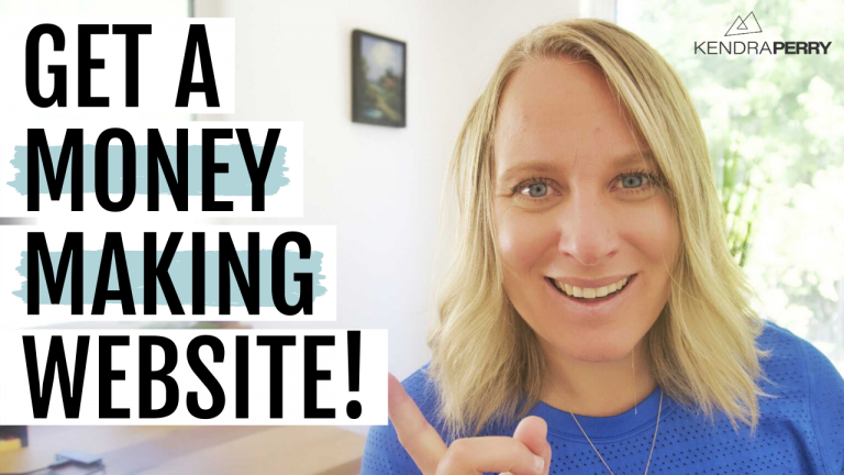
In today’s new YouTube Video, we dive into the 5 things you need to include on the homepage of your website.
I have seen some BAD BAD BAD websites in my time. In fact, some of those website have been mine. I’ve probably changed my website five times in my business…over the course of 6 years! Yikes
Here are the 5 things I learned you need to have on your health coaching website:
The most important information about what you do is above the fold
The fold is where the screen ends at first glance and people need to scroll to see further. So immediately when people come to your website, they should see what you do right there…no scrolling needed.
Above the fold should include a photo of you and what you do and who you help. Whoever is landing on your website should know immediately if the website is for them or not.
Put your free offer just below the fold
Your free offer can be above the fold section, or just a little bit below, but this is going to be your freebie, your lead magnet, your free opt in whatever you want to call it. And this is where you give away something of high value in exchange for that person’s email address. The most important thing that you do in your business is build your email list.
Show off those testimonials
When I buy any product online, I am going straight to the reviews. I want to see what other people have said about the product. And I will actually make the decision to purchase based off of the reviews. This is true for the coaching industry as well. People want to see that you have helped other people. If you’re brand new, that’s okay. You can skip this part, but it’s really important that as you work with clients, you make a really concerted effort to get testimonials.
A quick about you
The about you section…isn’t really about you. Confused? Any about me page is really more about your ideal client. So yes, you can tell your story, but really what you want to be saying on your homepage is how you can help them. So what do you do and why should they care?
Link to your program
Maybe you have a few different options for programs, or maybe you just have one, but this is a really good place to talk a little bit about your program. Don’t list the features as that’s not what sells a program. need to tell them why this program is going to help them get their desired outcome.
Remember, the most important information who you are and what you do is above the fold with the free opt in to get onto your email list. You want to pepper some testimonials. If you have them throughout that page, you want to have a little bit about you, a little bit about your programs, and that’s really all you need.

